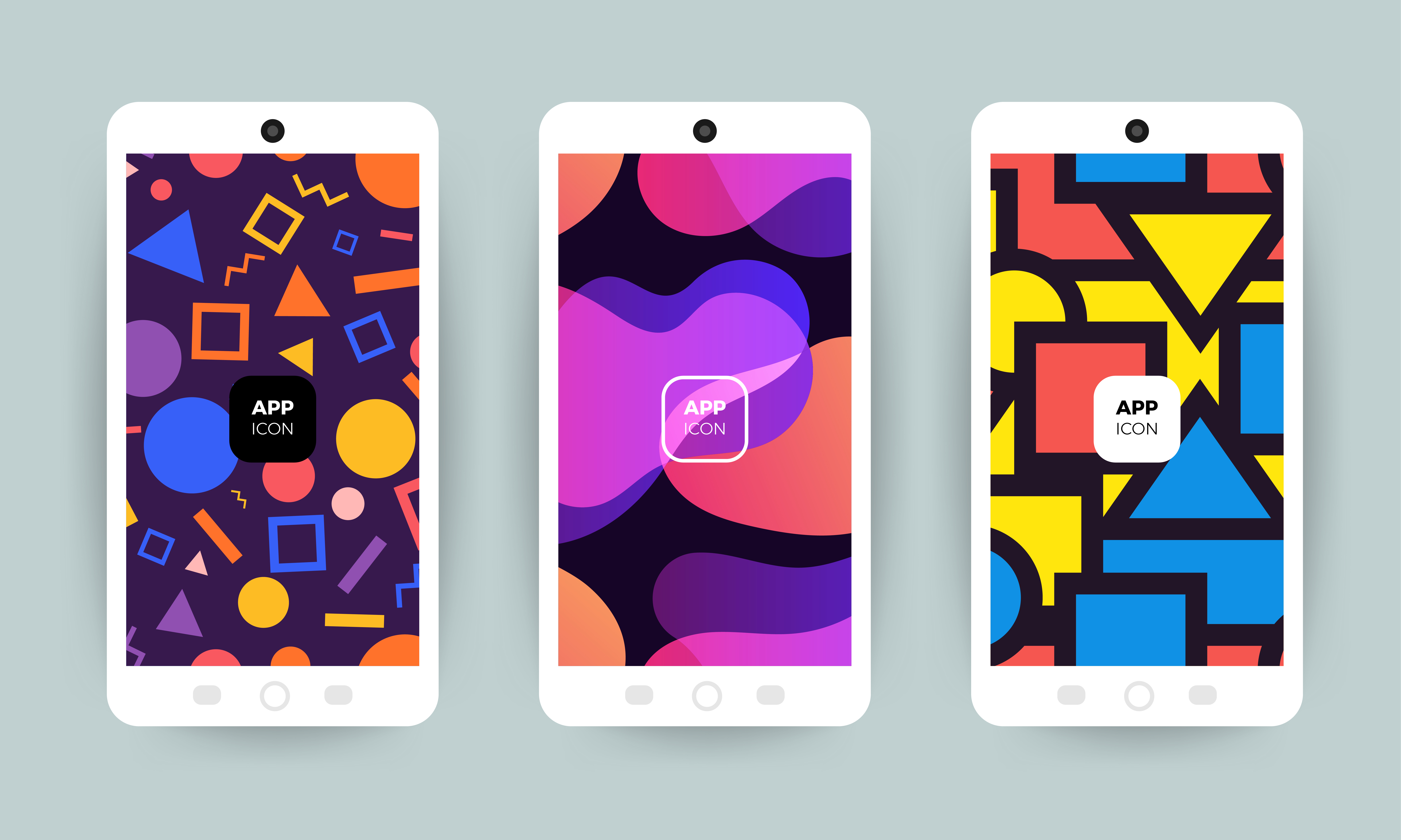
We tend to call the pocket-sized computers we obsessively tote around ‘smartphones.’ But the truth is, very few of us use them as a phone. According to one study, less than half of the population made or received a phone call over the last week. Instead, smartphones are wallets, car keys, navigators, and bank tellers.
Responsive design is no longer an afterthought. Apps, forms, and processes must perform just as exquisitely on mobile as they can on desktop. Tip-top mobile experiences transform complex processes into bite-sized, tappable experiences that delight and engage, whether you’re lounging on the sofa or squished on a crowded train.
Enter: ProcessMaker’s Summer Release. See how new Design for Mobile Screens features make designing workflows for smartphones, tablets, and mini devices a breeze.
See for yourself! Try out the latest features of ProcessMaker Platform for free.
Why workflows need mobile-friendly interfaces and experiences
We’re checking our phones 144 times per day. And its influence is springing off the screen and into the real world.
Mobile devices are shapeshifting into remote controls for IoT devices. They’re veritable flight decks for piloting your life: turn up the heat in your living room before leaving the office, start your SUV, or jump inside the fridge to assess dinner options.
The trend ramps up the number of industries dazzling users with stunning, highly optimized mobile experiences. Gone are the days of skating through by simply cramming your desktop site onto a smaller screen.
Whether you’re in banking or manufacturing, streaming services, social media, and ride-share apps set the new mobile design standard. Customers and employees expect the same level of functionality and aesthetic appeal from every brand they interact with.
Mobile-ready or mobile-only? More and more customers exclusively rely on tablets and smartphones
In some industries, mobile devices are the only way customers interact with your brand. In banking, 8 out of 10 millennials solely access services from their phone, underscoring how the smaller screen should be a top priority when launching new products.
For many smartphone users, the prospect of conducting complex business triggers instant cognitive overload. Research-heavy or high-stakes tasks send users straight to desktop.
But researchers ask—is this out of habit, or are companies simply not delivering the level of mobile responsiveness that customers need?
When we’re on our phones, patience is thinner. We might be in line at the coffee shop or eager to return to a social media doom scroll. Frustrating user experiences sting sharper on mobile.
Experts found that users only have patience for mobile experiences that take less than five minutes. As time investment climbed over this threshold, abandonment rates did too, topping 40% in some instances. Even with this insight available, researchers found that 25% of bank account opening processes took closer to ten minutes.
The findings underscore a gap between the level of service companies think they’re serving vs. the true experience of their customers.
With ProcessMaker’s new Design for Mobile Screens features, it’s easier than ever to launch apps, forms, and processes that meet best practices for mobile design. With these tools, you’ll be able to serve smartphones in a way that not only matches but outpaces your desktop experience.
How to optimize ProcessMaker forms and processes for mobile
With the new Design for Mobile Screens features that shipped with the ProcessMaker Summer Release, you can craft your mobile experience down to the last detail.
Hide an element or two, or create a completely different experience exclusively for mobile screens. With these new tools, you can ensure your workflow is sharp, streamlined, and satisfying on Apple iOS or Android.
Start with responsiveness to shape a stellar mobile-friendly interface. New views show how your layout renders on various screen sizes, so you can tweak the placement of key elements.
Want to hide an element for mobile users? No problem. In the controls, you can create rules to turn logos, text blocks, titles, or form fields on or off, depending on the user’s device.
This feature helps you do much more than mask unwanted elements. You can create entirely unique experiences just for mobile users. Add unique phrasing, mobile-only messaging, or drop in distinct images or backgrounds. You have the freedom to tailor your mobile experience as you see fit.
Tips for designing automated workflows for mobile
Clutter is one of the top design flaws. In fact, 20% of users will hunt for the ‘X’ button if a process feels too long or complicated. “The design isn’t sleek and not very intuitive” and “I can’t even see half the app” are common complaints amongst mobile users.
How can you set up your mobile experience for high marks?
-
Collect as little information as possible: Many mobile forms ask for less information than the desktop version. Too many distracting elements can overwhelm customers, so stick with razor-sharp, need-to-know questions. You can easily hide nonessential fields with the new Design for Mobile features.
-
Stick with a single-column format: Information presented in one scrollable column outpace multicolumn layouts. Additionally, the study found that multicolumn fields are more prone to errors. So keep your form as tight as possible.
-
Start with the easiest information: Start with the basics. You might notice most forms kick things off with softball questions like name or email address. It makes an excellent first impression, quietly whispering to users that this form will be easy. If you have to collect more laborious details, or send users hunting for a document to upload, save these questions for later on.
-
Tell customers what to expect: Guard rails on curvy roads aren’t just physical barriers. A glimpse of one informs drivers that the upcoming segment is curvy, automatically telling the brain to be more careful. If you’re going to need a document or photo upload later in the form, use the controls to insert an introductory checklist when ProcessMaker detects a mobile device.
See for yourself! Try out the latest features of ProcessMaker Platform for free.
Some stakeholders dismiss mobile-first strategies as a consumer-leaning trend. But we’re all consumers, and our tastes and preferences trickle readily into the workplace. For office workers, tablets and smartphones are becoming a tool of choice.
MIT Sloan School of Management gauges the U.S. remote workforce somewhere between 27 and 50%. Time-off requests, onboarding processes, and submissions for reimbursement need to be as easy as reordering favorite Thai dishes from last weekend’s dinner-in.
Improve user adoption by boosting mobile app accessibility
Keep in mind: Users of different abilities interact with your brand. Wield Design for Mobile tools to tweak your mobile layout so it’s a cinch for anyone to feel comfortable using.
-
Make sure buttons are large enough for thumbs and finger taps
-
Avoid busy, wild color palettes that might confuse a user whose brain’s interpretation of color doesn’t align with hex codes
-
Keep elements in a single column. Many users rely on their phone’s magnification features. Forms that require panning or pinch-to-zoom are challenging to navigate with a magnifier.
-
Keep instructions clear and double-check how mobile devices sequence elements. People who use screen readers or other voice-to-text tools will thank you kindly.
Nearly three-quarters of people living with vision, hearing, or fine motor disabilities will immediately abandon mobile experiences that are not accessible. But as of 2022, only 3% of the internet meets best practices for these users. Many governments require equal access to technologies, so straightening your accessibility plan is key.
Underneath the bustling world of scrolling thumbs and tapping fingers lives a big opportunity for your organization. Almost 70% of users say they’d rather award a sleek, intuitive mobile experience with their business than tussle with a mobile app or form fraught with challenges. By serving an unbeatable experience on smartphone screens, you can grab the interest of new customers and build a long-term loyalty base.


